Seesaw is such a versatile app for student journals and formative and summative assessment. Keynote works perfectly with Seesaw with its choice of themes and its easy-to-use interface.
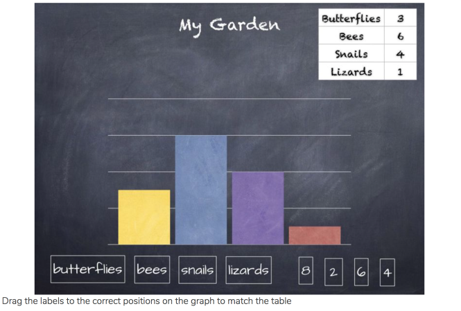
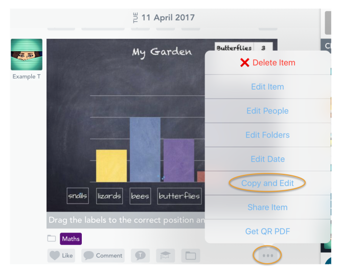
The following is an assessment for students to show their understanding of bar graphs, by dragging labels to their correct position, but it could also be used as a task for students to create their own bar charts from collected data.
Click here to view in Seesaw.
- Create Presentation and choose a theme, I chose Standard. as this is the perfect size for iPad screens. In this example I chose Chalkboard. Give your Keynote a title by tapping on the title at the top (optional).
- Add a slide (+ at bottom left of page) and choose Blank (or delete the text holders) so you have a blank chalkboard.
- To add the Table, tap on the + in the toolbar and select the first table option and choose your style. You can format the table to any desired size, and choose font options, cell colour etc. using the paintbrush icon. Drag the finished table to the top right.
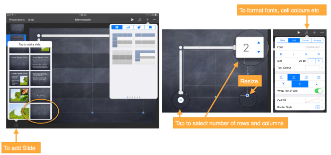
- To add the Chart, tap on the + and select the bar charts (there are of course many table and graph options to choose from, but I chose top left). You can format the chart to any desired size, and choose font options, colours, style etc. using the paintbrush icon.
- As the default chart has 2 regions, an extra step is required to look like my example. Tap on the newly inserted table, tap Edit Data and tap on the blue tab to the left of Region 2, to highlight the entire region. Tap again and select Delete. Tap on the cog and tick Plot Columns as Series.
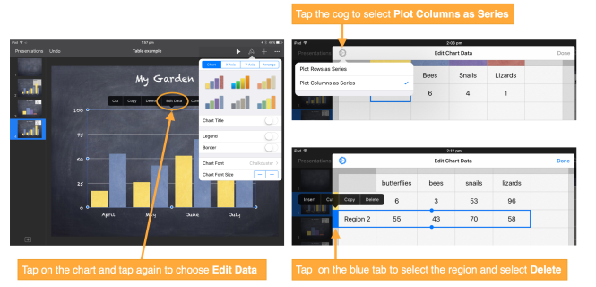
- Input the chart data to the cells. Tap Done.
- I chose to have no axis labels (as it was an assessment), by tapping on the paintbrush icon and turning off Category Labels for each axis. However, if students are creating their own, you could add axis labels etc. Drag the finished chart to the desired position (leaving some room for the labels to be added).
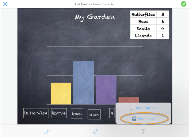
- When complete, take a screenshot of the page.
- In Seesaw, add this with the green + and add from Camera Roll. Tap the green tick.
- Create labels in Seesaw for the graph labels and numbers by tapping the T and choosing Add Label. Type your label and then tap on the label to edit or change style. Drag them to the bottom. Doing it this way allows the students to move the labels around.
- Tap the tick when finished with the labels.
- To add any instructions, tap the T again and choose Add Caption to add instructions.
- Tap the tick to add to your desired class.
- Instruct students to Copy and Edit from the 3 dot menu so they can make their own copy to submit.
There are so many other ways to use Keynote and Seesaw together. Here are just a few: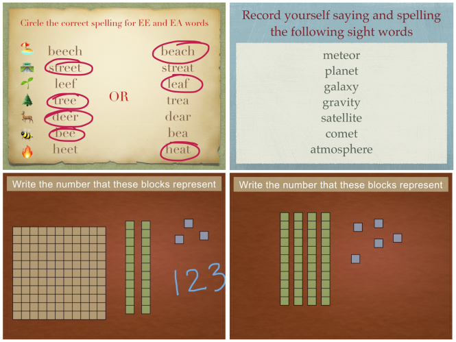
I put Seesaw and Keynote in my Top 10 Best Cross-Curricular apps in the classroom.
To learn more about the capabilities of Keynote, consider earning your Keynote badge in the Apple Teacher Program. I have used Keynote for many years and still learned a lot doing the program!